


FARB WERK colour chart
FARB WERK colour chart
Colour choices for professionals – the choice for you!
Tools for professionals to compose harmonious and perfectly matched colour combinations on Farby KABE products.
Contains a collection of 390 selected colours. It is the result of many years of experience with high quality products and close collaboration with colourists, architects and designers.
The four colour palettes of the FARBwerk colour chart, inspired by nature, includes a practical systematization of colours, perfectly composed for decorating facades as well as residential and industrial spaces.
Each of the four colour palettes allows to safely choose any set of colours, all of which match each other perfectly. This is what distinguishes FARBwerk Farby KABE from others available on the market.
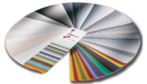 |
FARBwerk 1 The FARBwerk 1 colour chart is devoted to a wide range of shades of gray. This part takes into account the main trends in composing modern colour palettes and the shades used in the field of renovation of historic and sacred buildings. Naturally occurring grays in the shades of chalk, birch, slate and basalt are currently the most popular choice in the design and decoration of modernist and industrial objects. FARBwerk 1 is prepared to create a harmonious colour combination in combination with other groups of contrasting colours and other colour palettes in parts 2 to 4. |
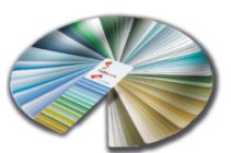 |
FARBwerk2 The FARBwerk 2 colour chart contains a harmonious combination of blue and green colours which, depending on the intensity, gradation and composition, can be used to achieve a unique effect and set new design trends. In addition to the natural warm colours of olive, moss or cool lilac and blue blues, this palette uses shades prepared on the basis of synthetic inorganic pigments, such as cobalt blue, chrome green or ultramarine. The resulting diversity effect of this colour palette allows us to keep pace with the limitless inspirations of designers and architects who follow the trend of industrialization in harmony with natural beauty. Thanks to their specific character, they introduce splendor of colours for every type of architecture. |
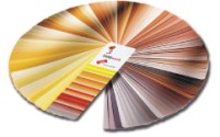 |
FARBwerk3 The mood of the sunset over the summer field of cereals or the exotic Sahara is dominated by the world of colours in the FARBwerk 3 template. The natural colours of autumn nature reign superseded with the play of light. Subtle colour nuances are emphasized by the delicate shades of sand and expressive tones of rusty ocher. The pigments used offer a wonderful variety of shades from subtle lemon yellow to intense English red. |
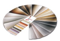 |
FARBwerk4 The colours of earth, wood and stone. Moreover, the influence of various architectural eras shaped the FARBwerk 4 template. Various shades of sandstone used for centuries have played an important role in architecture and colour selection. Shades of brown, beige and noble greenish gray give unlimited colour inspiration. Also, raw concrete, on closer inspection, reveals the richness of shades that were perfectly used in this part of the template. Wooden elements so willingly integrated into the building had a significant impact on complementing the colours of this palette, ranging from grayish browns to expressive chestnut or mahogany brown. |